Exploring Stock Relationships with Tiingo News
One of the best things about the Tiingo API is the news feed. One feature is that if you look for news associated with a specific ticker, for all the articles returned, you can see which other tickers were mentioned as well. This got me thinking about finding potential associations between stocks more quickly than waiting for the correlation to show up in their price, or other associative techniques.
Luckily, there was a recent news event to test this theory; Apple recently accounced that they acquired Intel’s chipmaking division, freeing them from having to rely on Qualcomm for their iPhone chips. This changes the connection between Apple and Intel and Qualcomm, respectively, and potentially the correlation.
library(data.table)
library(dtplyr)
library(tidyquant)
library(riingo)
library(igraph)
library(ggraph)
library(patchwork)

set.seed(8675309)


# Intel & Qualcom Returns
returns_monthly <- c('INTC', 'QCOM') %>%
  riingo_prices(start_date = '2013-08-01', end_date = Sys.Date()) %>%
  group_by(ticker) %>%
  tq_transmute(select     = adjClose,
               mutate_fun = periodReturn,
               period     = "monthly")

# Baseline Returns
baseline_returns_monthly <- "AAPL" %>%
  riingo_prices(start_date = '2013-08-01', end_date = Sys.Date()) %>%
  tq_transmute(select     = adjClose,
               mutate_fun = periodReturn,
               period     = "monthly")
# Join
returns_joined <- left_join(returns_monthly,
                            baseline_returns_monthly,
                            by = "date")

# Rolling Correlation
rolling_corr <- returns_joined %>%
  tq_transmute_xy(x          = monthly.returns.x,
                  y          = monthly.returns.y,
                  mutate_fun = runCor,
                  n          = 6,
                  col_rename = "rolling.corr.6")

# Plot Correlations
rolling_corr %>%
  ggplot(aes(x = date, y = rolling.corr.6, color = ticker)) +
  geom_hline(yintercept = 0, color = palette_light()[[1]]) +
  geom_line(size = 1) +
  labs(title = "Intel & Qualcomm Six Month Rolling Correlation to AAPL",
       x = "", y = "Correlation", color = "") +
  facet_wrap(~ ticker, ncol = 2) +
  theme_tq() +
  scale_color_tq()
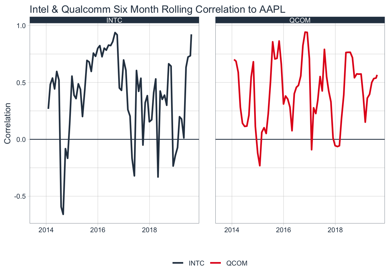
The Qualcomm correlation is mostly unchanged, but the intel correlation is near it’s high recently.
The wonderful riingo package has functions to access the news feed. In the core package, maintained by Business Science, the riingo_get_news functions are unfinished. I’ve finished them and submitted a pull request, but until then you can install the package from my repo via remotes::install_github('amiles2233/riingo'). Also, you need a paid subscription to the Tiingo api for the functions to work, but it’s very reasonably priced at $10 per month.
To ensure I get equal coverage across days, I created a function that will pull 100 articles per day.
## Function to pull up to 100 Articles Daily
get_daily_articles <- function(ticker, date) {
  news <- riingo_news(ticker=ticker,
                      start_date = date-1,
                      end_date = date,
                      limit = 100) %>%
    convert_to_local_time()

  return(news)
}

## Last 30 Days
dates <- seq((Sys.Date()-30), Sys.Date()-1, by='days')

## Pull 30 days for Aaple
news <- map2_df(.x='AAPL', .y=dates, get_daily_articles)

glimpse(news)
## Observations: 1,993
## Variables: 9
## $ tickers <list> [<"aapl", "c", "dow", "dow", "mrk">, "aapl", <"aa…
## $ description <chr> "US Indexes Post Another Day of Closing Record Hig…
## $ publishedDate <dttm> 2019-07-15 18:43:16, 2019-07-15 18:36:00, 2019-07…
## $ tags <list> [<"Financial Services", "Healthcare", "Materials"…
## $ crawlDate <dttm> 2019-07-15 19:14:48, 2019-07-15 19:23:54, 2019-07…
## $ title <chr> "US Indexes Post Another Day of Closing Record Hig…
## $ id <int> 18331941, 18332144, 18331774, 18332230, 18332260, …
## $ source <chr> "gurufocus.com", "fool.com", "zacks.com", "nasdaq.…
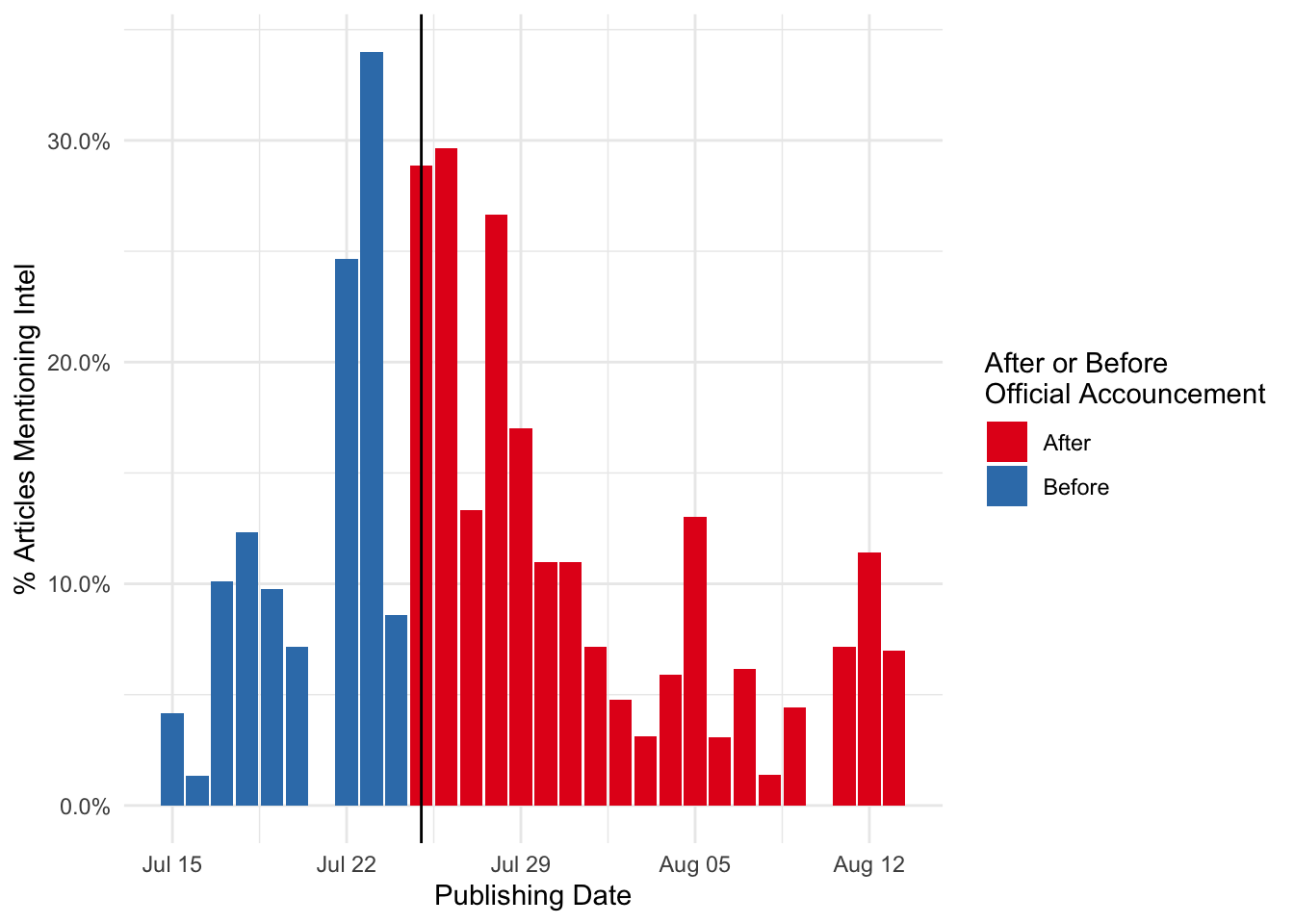
## $ url <chr> "https://www.gurufocus.com/news/909040/us-indexes-…We see that tickers are stored in a list column, with multiple tickers being associated with each news article. With this data, we can look at how often Intel is mentioned with Apple by day. The official announcement was July 25th, so we should expect to see a bump in the surrounding days
## Unnest the ticker list
news_long <- news %>%
  mutate(after_announcement=ifelse(as.Date(publishedDate)>='2019-07-25', 'After', 'Before')) %>%
  select(id, after_announcement, publishedDate, tickers) %>%
  unnest(tickers) %>%
  distinct()


news_long %>%
  mutate(intel=ifelse(tickers=='intc', 1, 0),
         publishedDate=as.Date(publishedDate)) %>%
  group_by(after_announcement, publishedDate) %>%
  summarize(total_article=n_distinct(id),
            intel=sum(intel)) %>%
  mutate(pct_intel=intel/total_article) %>%
  arrange(publishedDate) %>%
  ggplot(aes(x=publishedDate, y=pct_intel, fill=after_announcement)) +
  geom_col() +
  geom_vline(xintercept = as.Date('2019-07-25')) +
  scale_fill_brewer(palette = 'Set1', name="After or Before\nOfficial Accouncement") +
  theme_minimal() +
  ylab('% Articles Mentioning Intel') +
  xlab('Publishing Date') +
  scale_y_continuous(labels=scales::percent)
There’s quite a bit of variation at the day level, but there is a definite uptick in the days surrounding the official announcement. At the peak, articles mentioned with intel are almost 1/3 of all apple articles.
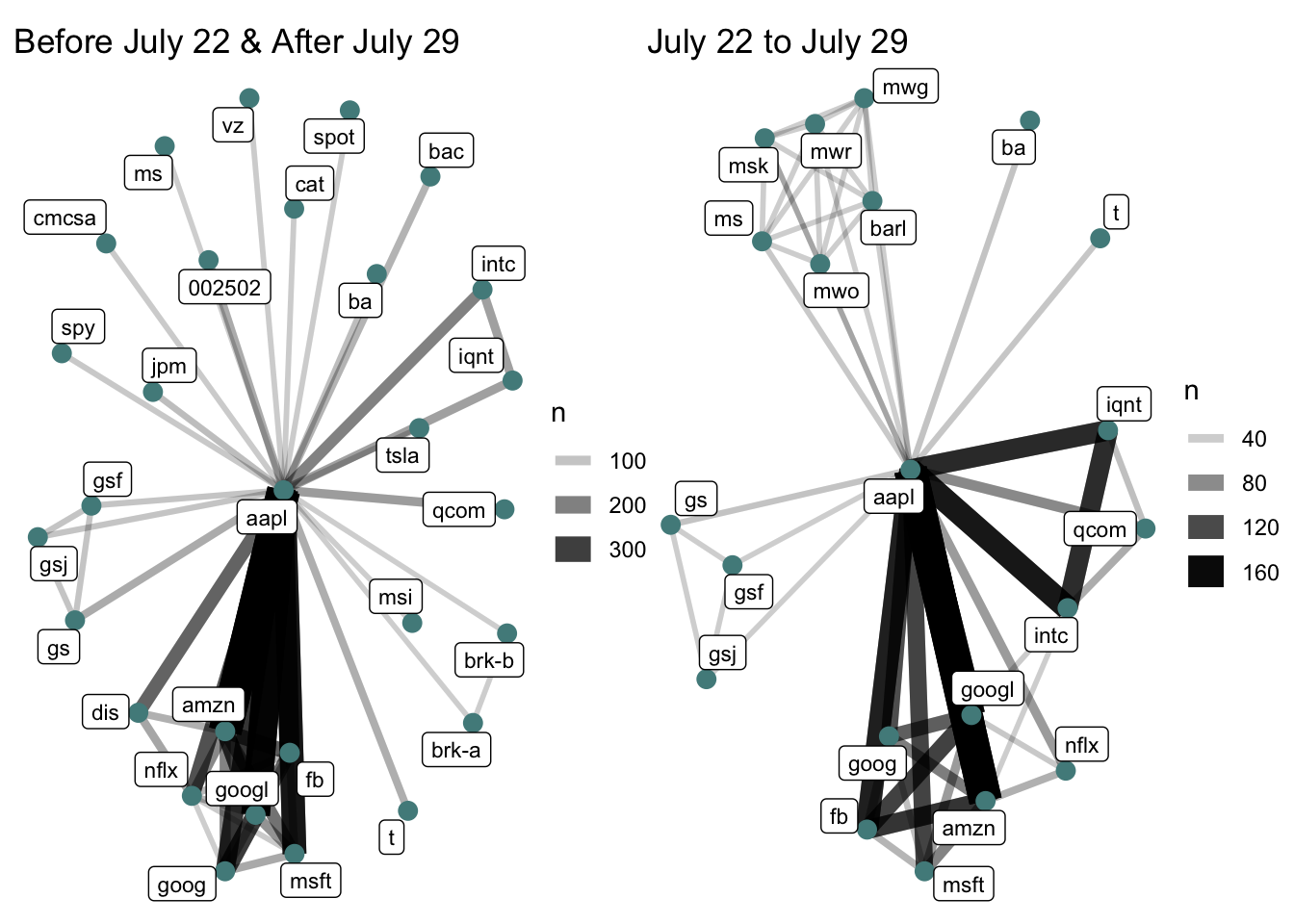
Visualizing this a different way, we can see relationships plotted on a network graph. This will allow us to see the intel relationship in context of all other relationships. To do this, we have do a self join on the news dataset, a common technique in market basket analysis.
## Extract News ID and Dates
news_date <- news %>%
  select(id, publishedDate)

## Pare Down
news_long_limit <- news_long %>%
  select(id, tickers) %>%
  distinct()

## Self Join
news_joined <- news_long_limit %>%
  left_join(news_long_limit, by='id') %>%
  left_join(news_date, by='id')


## Network Plot exlcuding week of announcement
a <- news_joined %>%
  filter(publishedDate<'2019-07-22' | publishedDate>'2019-07-29') %>%
  group_by(tickers.x, tickers.y) %>%
  filter(tickers.x!=tickers.y) %>%
  summarize(n=n_distinct(id)) %>%
  ungroup() %>%
  arrange(-n) %>%
  top_n(100,n) %>%
  graph_from_data_frame()  %>%
  ggraph(layout = "fr") +
  geom_edge_link(aes(edge_alpha = n, edge_width = n)) +
  geom_node_point(color = "darkslategray4", size = 3) +
  geom_node_label(aes(label = name),  size = 3, repel = TRUE) +
  theme_void() +
  ggtitle('Before July 22 & After July 29')

## Network graph for week of announcement
b <- news_joined %>%
  filter(publishedDate>='2019-07-22' & publishedDate<='2019-07-29') %>%
  group_by(tickers.x, tickers.y) %>%
  filter(tickers.x!=tickers.y) %>%
  summarize(n=n_distinct(id)) %>%
  ungroup() %>%
  arrange(-n) %>%
  top_n(100,n) %>%
  graph_from_data_frame()  %>%
  ggraph(layout = "fr") +
  geom_edge_link(aes(edge_alpha = n, edge_width = n)) +
  geom_node_point(color = "darkslategray4", size = 3) +
  geom_node_label(aes(label = name),  size = 3, repel = TRUE) +
  theme_void() +
  ggtitle('July 22 to July 29')

## Plot together
a+b
Clearly from this, we can see an uptick in the intel relationship for the week of the accouncement. From this chart as well, we can see that Qualcomm and Intel are mentioned together in the week of the accouncement (which makes sense, as Apple replaced Qualcomm with Intel).
Another interesting piece of information extracted from these plots is the baseline relationship between Apple and other tech giants like Microsoft, Facebook, Netflix, and Google. These tickers are just always mentioned together. A key to extending this analysis would be to model a baseline co-occurence between two tickers, and look at how that varies over a given timeframe.
Overall, this analysis showed an example of how we can see how the frequency by which tickers get mentioned together reflect real life changes in relationships. One challenge here is news volume, companies like Apple get mentioned a lot while most companies get only an article every few days, making it difficult to observe a baseline and deviation.