Building Optimal Daily Fantasy Lineups in R
‘Are you ready for some footbaaaalll?!’ It’s that time of the year, the NFL is back! Like many others, part of my enjoyment of football season is through fantasy football, specifically daily fantasy (like DraftKings or Fanduel is you’re unfamiliar). Obviously, I want to apply my analytic skillset to give me an edge, and there’s lot of great packages in R that make that easier to do.
In this post, I’ll be using the great ffanalytics package to scrape projections from multiple sites, and simulate multiple optimal lineups to get an idea of which players to target in my lineups.
The first step, as always, is getting the right packages loaded
library(data.table)
library(dtplyr)
library(tidyverse)
library(ffanalytics)
library(lpSolve)
library(rPref)
library(kableExtra)

## Specify Week
week <- 3
Scrape Projections
Next, we select the sources we want to pull from. (I’d normally include ESPN in here, but the results have been buggy the last few times I’ve pulled).
sources <- c('CBS', 'Yahoo', 'FantasySharks', 'NumberFire', 'FantasyPros', 'FantasyData', 'FleaFlicker')

scrape <- scrape_data(src = sources,
                      pos=c('QB', 'RB', 'WR', 'TE', 'DST'),
                      season = 2019,
                      week=week)
A nice feature of ffanalytics is that you can provide custom scoring schemas. Here, I set up the DraftKings scoring schema and apply it to the scraped data, so all projections will be in that format.
scoring <- list(
  pass = list(
    pass_att = 0, pass_comp = 0, pass_inc = 0, pass_yds = 0.04, pass_tds = 4,
    pass_int = -1, pass_40_yds = 0,  pass_300_yds = 3, pass_350_yds = 0,
    pass_400_yds = 0
  ),
  rush = list(
    all_pos = TRUE,
    rush_yds = 0.1,  rush_att = 0, rush_40_yds = 0, rush_tds = 6,
    rush_100_yds = 3, rush_150_yds = 0, rush_200_yds = 0),
  rec = list(
    all_pos = TRUE,
    rec = 1, rec_yds = 0.1, rec_tds = 6, rec_40_yds = 0, rec_100_yds = 3,
    rec_150_yds = 0, rec_200_yds = 0
  ),
  misc = list(
    all_pos = TRUE,
    fumbles_lost = -1, fumbles_total = 0,
    sacks = 0, two_pts = 2
  ),
  ret = list(
    all_pos = TRUE,
    return_tds = 6, return_yds = 0
  ),
  dst = list(
    dst_fum_rec = 2,  dst_int = 2, dst_safety = 2, dst_sacks = 1, dst_td = 6,
    dst_blk = 2, dst_ret_yds = 0, dst_pts_allowed = 0
  ),
  pts_bracket = list(
    list(threshold = 0, points = 10),
    list(threshold = 1, points = 7),
    list(threshold = 7, points = 4),
    list(threshold = 14, points = 1),
    list(threshold = 21, points = 0),
    list(threshold = 28, points = -1),
    list(threshold = 35, points = -4)
  )
)


proj <- projections_table(scrape, scoring_rules = scoring) %>%
  add_player_info()
Now that we have the projections in the proper format, we need to add player salaries. I don’t have a site to programatically pull this from, the way I do it currently is just from exporting from the DraftKings lineup page. There’s some cleaning that has to be done in order to make the names match, (Todd Gurley is an example), and I’m sure there’s a cleaner way to do this, but hey it worked so far.
Another potential issue is sites not updating their injury reports. For example, Trevor Siemian still had a projection for some sites, even though he’s out for the season, so I manually remove him
## Read in DraftKings
injured <- c('Trevor Siemian') ## Remove Injured Players

sal <- read_csv('DKSalaries.csv') %>%
  filter(!Name %in% injured)

sal$Name[sal$Name=='Todd Gurley II'] <- 'Todd Gurley'
Build Optimal Lineups
Next I define a function to merge the salary data with the prediction data, and randomly generate a points estimate for a given player, which I’m able to do because ffanalytics provides standard deviations for their projections, allowing me to pull projections from a probability distribution. I then generate a lineup via lpsolve. Building lineups is a variant of the classic ‘knapsack’ problem in optimization, I only have so much salary, and I need to fit players in my lineup that will get me the most points while meeting certain constraints (1 QB, 2 RB, 3 WR, 1 TE, 1 DST, 1 Flex, all under $50,000). I repeat this process 10,000 times, giving me 10,000 lineups under 10,000 scoring scenarios.
generate_lineup <- function(n){

  pred_sal <- proj %>%
    filter(avg_type=='robust') %>%
    mutate(Name = ifelse(pos=="DST", last_name, paste(first_name, last_name))) %>%
    inner_join(sal, by=c("Name")) %>%
    select(Name, team, position, points, Salary, sd_pts) %>%
    filter(!is.na(points), !is.na(Salary)) %>%
    group_by(Name) %>%
    mutate(sal_max=max(Salary)) %>%
    filter(Salary==sal_max) %>%
    group_by(Name) %>%
    mutate(pts_pred = rnorm(1, points, sd_pts),
           lineup=n) %>%
    select(-sal_max)


  obj <- pred_sal$pts_pred

  mat <- rbind(t(model.matrix(~ position + 0,pred_sal)), t(model.matrix(~ position + 0,pred_sal)), rep(1, nrow(pred_sal)), pred_sal$Salary)

  dir <- c("=","=","<=","<=","<=", "=","=",">=",">=",">=","=","<=")

  rhs <- c(1,1,3,2,4,1,1,2,1,3,9,50000)

  result <- lp("max", obj, mat, dir, rhs, all.bin = TRUE)

  results <- pred_sal[which(result$solution == 1),]

  return(results)
}

sim_lu <- map_df(1:10000, generate_lineup) %>%
  rename(pts_base=points) %>%
  select(lineup, Name, team, position, pts_base, pts_pred, sd_pts, Salary)
Explore Optimal Lineups
Now that we have 10,000 optimal lineups, lets see how those lineups look.
Here’s a sample of three optimal lineups, so you can get a sense of what the data looks like.
sim_lu %>%
  filter(lineup<=3) %>%
  arrange(lineup, position, desc(pts_pred)) %>%
  knitr::kable() %>%
  kable_styling() %>%
  column_spec(1, bold=TRUE) %>%
collapse_rows(columns = 1, valign = 'top')| lineup | Name | team | position | pts_base | pts_pred | sd_pts | Salary |
|---|---|---|---|---|---|---|---|
| 1 | Dolphins | MIA | DST | 4.97000 | 6.598585 | 0.7086828 | 2000 |
| Dak Prescott | DAL | QB | 23.73500 | 24.971105 | 0.8272908 | 6500 | |
| Christian McCaffrey | CAR | RB | 24.96164 | 25.569784 | 1.0081680 | 8700 | |
| Devonta Freeman | ATL | RB | 12.71842 | 14.707710 | 1.0526460 | 4900 | |
| Zach Ertz | PHI | TE | 17.38000 | 18.002119 | 2.5352460 | 5700 | |
| Keenan Allen | LAC | WR | 20.24500 | 24.267924 | 2.6612670 | 7000 | |
| Sammy Watkins | KCC | WR | 17.73100 | 21.472349 | 2.6345802 | 6800 | |
| Emmanuel Sanders | DEN | WR | 14.76000 | 15.308993 | 1.5537648 | 4800 | |
| Nelson Agholor | PHI | WR | 13.08025 | 12.421407 | 0.6108312 | 3600 | |
| 2 | Cardinals | ARI | DST | 7.02700 | 7.956459 | 1.1327064 | 2700 |
| Jameis Winston | TBB | QB | 20.35533 | 20.534232 | 0.4922232 | 5400 | |
| Christian McCaffrey | CAR | RB | 24.96164 | 24.693976 | 1.0081680 | 8700 | |
| Ezekiel Elliott | DAL | RB | 24.45650 | 22.832514 | 2.1742329 | 8900 | |
| Zach Ertz | PHI | TE | 17.38000 | 16.542479 | 2.5352460 | 5700 | |
| O.J. Howard | TBB | TE | 8.45050 | 11.634965 | 1.4974260 | 3800 | |
| DeSean Jackson | PHI | WR | 11.60000 | 22.402629 | 8.5990800 | 5800 | |
| Larry Fitzgerald | ARI | WR | 15.60500 | 15.718476 | 0.8006040 | 5100 | |
| Nelson Agholor | PHI | WR | 13.08025 | 12.519298 | 0.6108312 | 3600 | |
| 3 | Steelers | PIT | DST | 6.83000 | 7.748545 | 0.8747340 | 2300 |
| Jameis Winston | TBB | QB | 20.35533 | 20.635016 | 0.4922232 | 5400 | |
| Saquon Barkley | NYG | RB | 22.66727 | 25.769062 | 2.5975152 | 9100 | |
| Christian McCaffrey | CAR | RB | 24.96164 | 24.227040 | 1.0081680 | 8700 | |
| C.J. Uzomah | CIN | TE | 4.88000 | 10.489492 | 2.6242020 | 2700 | |
| Julio Jones | ATL | WR | 19.08000 | 19.990107 | 1.9251561 | 7300 | |
| T.Y. Hilton | IND | WR | 16.04000 | 19.965852 | 1.8021003 | 6400 | |
| Larry Fitzgerald | ARI | WR | 15.60500 | 15.695509 | 0.8006040 | 5100 | |
| Darius Slayton | NYG | WR | 4.81500 | 10.644966 | 5.4633810 | 3000 |
Now that we have an idea of what the data looks let’s dig into what these optimized lineups are showing.
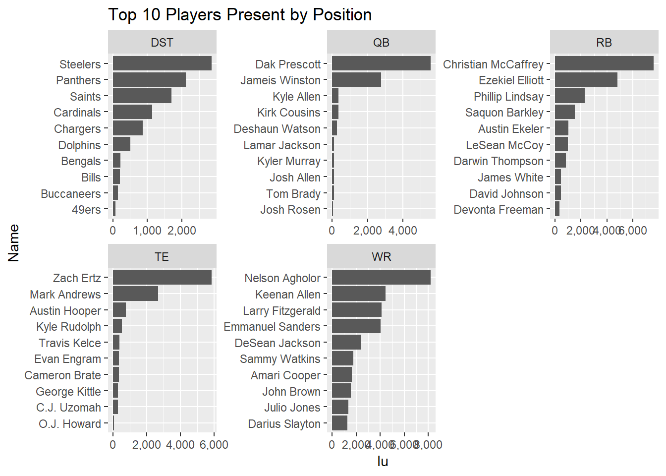
First, a look at which players are represented in optimal lineups. Here I’ll look at the top 10 by position.
sim_lu %>%
  group_by(Name, position) %>%
  dplyr::summarize(lu=n_distinct(lineup)) %>%
  ungroup() %>%
  group_by(position) %>%
  top_n(10, lu) %>%
  ungroup() %>%
  arrange(position, desc(lu)) %>%
  mutate(Name=factor(Name),
         Name=fct_reorder(Name, lu)) %>%
  ggplot(aes(x=Name, y=lu)) +
  geom_bar(stat='identity') +
  facet_wrap(~position, ncol = 3, scales='free') +
  coord_flip() +
  scale_y_continuous(labels = scales::comma) +
  ggtitle('Top 10 Players Present by Position')
From what we see here, Dak Prescott is a solid play for QB, as he shows in in around 5,500 lineups, or around 55% of all optimal lineups. The next most common is Jameis Winston, coming in at around 2,700 lineups, just over a quarter.
Now let’s look at flex configurations. As described above, in DraftKings and most daily fantasy, you have a flex spot, where you can place an extra RB, WR, or TE. Another thing we can learn from these optimal lineups is how often which configurations show up (e.g. how often an RB is selected for the flex position).
sim_lu %>%
  group_by(lineup) %>%
  mutate(lineup_pts=sum(pts_pred)) %>%
  group_by(lineup, position) %>%
  mutate(n=n()) %>%
  select(lineup, position, n, lineup_pts) %>%
  distinct() %>%
  spread(key=position, value=n) %>%
  filter(RB>=2, TE>=1, WR>=3) %>%
  mutate(flex=case_when(RB==3 ~ 'RB',
                        TE==2 ~ 'TE',
                        WR==4 ~ 'WR')) %>%
  group_by(flex) %>%
  dplyr::summarize(pts=median(lineup_pts),
                   cases=n()) %>%
  knitr::kable() %>%
kable_styling(full_width = FALSE)| flex | pts | cases |
|---|---|---|
| RB | 160.6642 | 2325 |
| TE | 161.8391 | 1900 |
| WR | 161.6524 | 5775 |
For this week, a WR has been put in the flex spot for about 57% of lineups, an RB in about 23% of lineups, and a TE in about 19% of lineups. Just looking at the median lineup points, there isn’t a large difference in scoring between flex configurations.
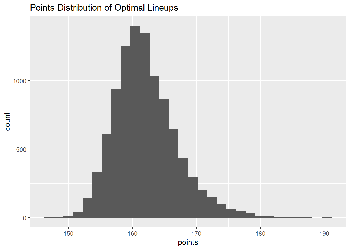
On that now, let’s look at the distribution of lineup points?
sim_lu %>%
  group_by(lineup) %>%
  dplyr::summarize(points=sum(pts_pred)) %>%
  ggplot(aes(x=points)) +
  geom_histogram() +
  ggtitle('Points Distribution of Optimal Lineups')
Nice, normal looking distribution!
A little too normal looking…
Here it is important to note that the standard deviation of the projection (supplied by ffanalytics) is used to estimate the true projection, not the true performance, that’s why the distribution is so tight and normal looking.
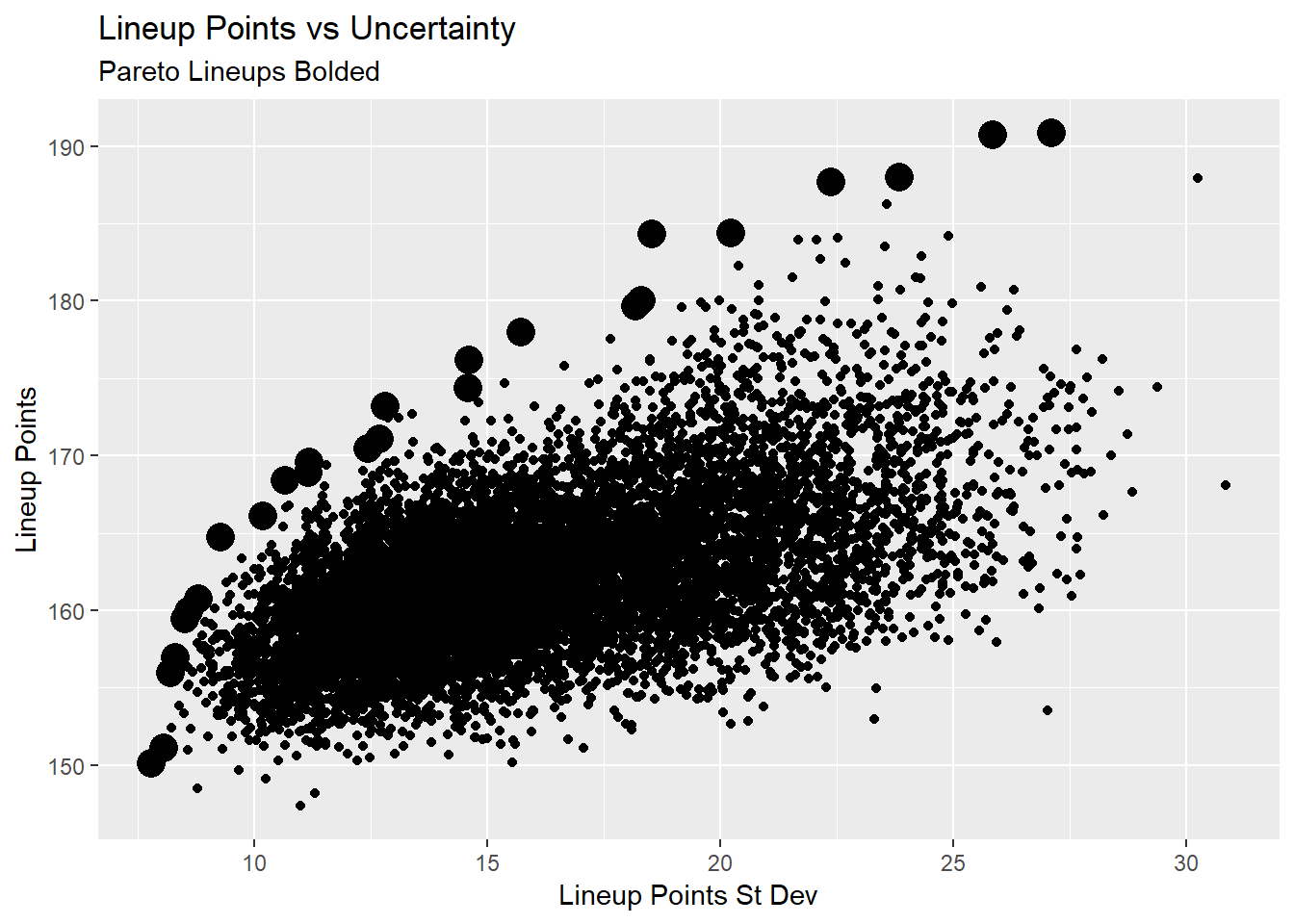
While you CAN enter a lot of lineups in DFS (less so than the old days), we can’t use all these lineups. So how do we narrow down? One way is to look at what’s called that Pareto frontier, lineups where we either maximize total lineup points, or minimize lineup standard deviation. If it sounds a little bit confusing, here’s a visualization to illustrate the point, the bolded points are the pareto lineups.
lu_df <- sim_lu %>%
  group_by(lineup) %>%
  dplyr::summarize(lineup_pts=sum(pts_pred),
                   lineup_sd=sum(sd_pts)) %>%
  ungroup()

pto <- psel(lu_df, low(lineup_sd) * high(lineup_pts))


ggplot(lu_df, aes(y=lineup_pts, x=lineup_sd)) +
  geom_point() +
  geom_point(data=pto, size=5) +
  ylab('Lineup Points') +
  xlab('Lineup Points St Dev') +
  ggtitle('Lineup Points vs Uncertainty',
          subtitle = 'Pareto Lineups Bolded')
This allows us to maximize the tradeoff between lineup points and lineup uncertainty. As expected, there’s a general trend of higher points lineups being more uncertain. We can leverage that uncertainty for certain games. For example, a lineup that has good points and lower uncertainty will be a good cash game play, where the higher uncertainty lineups are good GPP plays, where you want to focus on a lineup’s ceiling rather than their raw projection.
A csv with all 10,000 lineups is located here
Next Steps
While this analysis can improve our lineup building, there are some important limitations.
First, these projections are at the player level, taking no covariance into account. For example, Dak Prescott and Amari Cooper’s simulated scores are calculated separately, in a real life scenario, a better day from Dak probably means a better day for Amari, and a better model should take that into account.
Second, and on a similar note, optimal lineups don’t account for stacking (selecting, say, a QB and WR from the same team, because points for one means points for the other, allowing you to double dip), and one needs to be cognizant of that to both maximize a lineup’s upside, and limit it’s downside (e.g. don’t take a QB and their opposing defense, as their scores are negatively correlated).
These improvements will be coming in future weeks.