
Think Probabilisically? Model Probabilistally! Up and Running with Tensorflow Probability
Intro
Two areas I’ve spent a lot of time in are finance and sports. In these two fields, I often hear the refrain to ‘think probabilistically’, whether that means continuing to go for it on 4th down, even if you were stuffed the last time, or getting back into a trade even though the last one blew up in your face. As Annie Duke lays out in her book Thinking In Bets, all decisions have uncertainty and you have to be able to consider where your eventual outcome fell in the distributuon of possible outcomes. For example, if I saw a trade with a good setup, one that I’ve confirmed through tons of research and am confident in, and it doesn’t pan out, that doesn’t mean that was a bad trade, just that a less likely outcome occurred.
What is difficult, however, is quantifying this uncertainty. Do we know the range of outcomes? Do we know how likely various outcomes are, even if they are continuous? How do we evaluate a bad decision from a good decision that ended up having a bad outcome?
Measuring uncertainty is a critical part of effective statistical modeling and machine learning, yet if often gets put on the backburner. Often times the best techniques are confidence or prediction intervals (which often assume a normal distribituon), or quantile regression techniques. And with many machine learning techniques, there’s not much you can do to provide uncertainty estimates at all.
Telemarketing Voice: There must be a better way!
Participating in this year’s Big Data Bowl introduced me to modeling probability distributions (as predicting the distribution was the task, rather than just making a single yard prediction). First, my team tried to use gamlss, which is an awesome package, but isn’t computationally efficient and ended up not being a viable optionfor our volume of data.
Browsing around RStudio’s Tensorflow Blog, I saw that Sigrid Keydana has been regularly posting some great articles on Tensorflow Probability, which effectivly enables Tensorflow to model various probability distributions (currently, there are about 80 supported). In other words, Tensorflow Probability enables one to fit full distributions rather than single points. From these distributions, you can estimate quantiles, cumulative probability at a given point, and better estimations of upside and downside potential.
This is a pretty sweet development if it works as advertised, merging the flexibility and power of tensorflow with the core statistical concept of probability! You can answer a lot of questions with that!
In this post, I hope to show the usage of Tensorflow Probability (TFP), via the tfprobability R package, in a few different use cases.
First, I’ll test it on some simulated data in order to see if TFP can the parameters of our simulated distribution.
Next I’ll pass some Big Data Bowl data through and see if TFP can pick up on how starting yard line affects the possible outcomes for yards rushed.
Finally, I’ll look at stock data, and see if TFP can capture some basic information about the distribution of next-day prices.
In this post, I’ll be focusing on the Sinh-Arcsinh transformation of the normal distribution, due to the fact that it’s a very flexibile transformation where you can account for skew and tailweight. Given that both Big Data Bowl and stock data are cases where outcomes are not normally distributed, and predicting fat tails can be just as , if not more, important than a point prediction. If you want to read more about the Sinh-Arcsinh Transformation, it’s summed up succintly in this post.
Setup
library(reticulate)
library(tictoc)
library(gamlss.dist)
library(patchwork)
library(gganimate)
library(gifski)
library(tensorflow)
library(tfprobability)
library(keras)
library(tidyverse)
library(scales)
library(labeling)
Simulated Data
In order to provide an initial test to TFP, I’ll simulate a simple relationship and add random noise from the Sinh-Arcsinh distribution.
n <- 10000
x <- seq(0, 6, length.out = n)
x_valid <- seq(0, 6, length.out = n/2)
noise_dist <- tfd_sinh_arcsinh(loc=0, scale = .5, skewness = 1.5, tailweight = .8)

y <- tf$math$add(x, tfd_sample(noise_dist, n)) %>% as.numeric()
y_valid <- tf$math$add(x_valid, tfd_sample(noise_dist, n/2)) %>% as.numeric()
The distributional noise we add have the properties: scale=.5, skewness=1.5, and tailweight=.8 Therefore, if TFP works, it should fit a distribution with these parameters. Here is what the relationship looks like, with the red line representing a 1:1 relationship between x and y
data.frame(x,y) %>%
  ggplot(aes(x=x, y=y)) +
  geom_point(alpha=.3) +
  theme_minimal() +
  geom_abline(slope = 1, intercept = 0, color='red', size=2)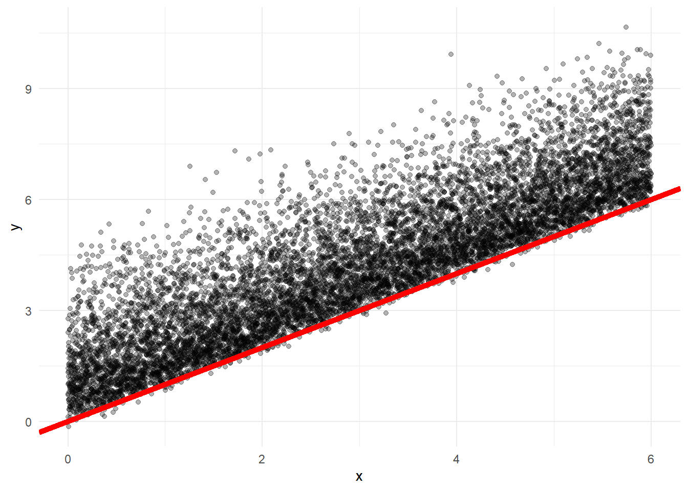
Now let’s fit the model.
Here we’ll just do a simple neural net, with 8 hidden layers. Notice the main differences between this and a regular keras model. Normally, with a regression problem, you’d have your last layer would have one neuron, representing the point prediction. Here, we have a layer with 4 neurons, which represent each of the parameters of the distribution. We then pass those neurons into this layer_distribution_lamba which takes those neurons and applies them to a given distributon. In the case of Sinh-Arcsinh, there are four parameters. In the case of a normal distribution, there would be two parameters (mean, and standard deviation).
You’ll also notice I apply some transformations to some of the neurons, specifically those representing the scale and tailweight parameters. This is because we need to ensure these values are positive, as the distribution would be undefined if they were negative (e.g. you can’t have a distribution with a negative standard deviation). The softplus transformation is similar to the of an exponential transformation, but Sigrid uses the softplus transformation, so I’m just sticking with that.
x <- as.matrix(x)
x_valid <- as.matrix(x_valid)


model <- keras_model_sequential() %>%
  layer_dense(units = 16, activation = "relu") %>%
  layer_dense(units = 4, activation = "linear") %>%
  layer_distribution_lambda(function(x) {
    tfd_sinh_arcsinh(loc = x[, 1, drop = FALSE],
                     scale = 1e-3 + tf$math$softplus(x[, 2, drop = FALSE]),
                     skewness=x[, 3, drop=FALSE],
                     tailweight=1e-3 + tf$math$softplus(x[, 4, drop = FALSE]),
                     allow_nan_stats=FALSE)
    }
   )

negloglik <- function(y, model) - (model %>% tfd_log_prob(y))


learning_rate <- 0.01
model %>% compile(optimizer = optimizer_adam(lr = learning_rate), loss = negloglik)

history <- model %>% fit(x, y,
                         validation_data=list(x_valid, y_valid),
                         epochs = 500,
                         batch_size=1000,
                         callbacks=list(callback_early_stopping(monitor='val_loss', patience = 20))
)
Now, in order to test, let’s make a new vector of values in the same range, run the trained model on that, and see if the parameters fit are the same as those we passed to the noise distribution
x_test <-  seq(0, 6, length.out = n/4)
y_test <-  tf$math$add(x_test, tfd_sample(noise_dist, n/4)) %>% as.numeric()


pred_dist <- model(tf$constant(as.matrix(x_test)))

loc <- pred_dist$loc %>% as.numeric()
scale <- pred_dist$scale %>% as.numeric()
skewness <- pred_dist$skewness %>% as.numeric()
tailweight <- pred_dist$tailweight %>% as.numeric()

pred_df <- data.frame(
  x = x_test,
  y = y_test,
  loc = as.numeric(pred_dist$loc),
  scale = as.numeric(pred_dist$scale),
  skewness=as.numeric(pred_dist$skewness),
  tailweight=as.numeric(pred_dist$tailweight)
)
Remember the desired properties were scale=.5, skewness=1.5, and tailweight=.8. We noise randomly sampled from this distribution, so they won’t be exact, but we should see these numbers. Let’s look at the results.
quantile(pred_df$loc)## 0% 25% 50% 75% 100%
## 0.4292076 1.6910421 2.9246817 4.1583214 5.3919611quantile(pred_df$scale)## 0% 25% 50% 75% 100%
## 0.4062814 0.4513346 0.5002638 0.5531937 0.6377828quantile(pred_df$skewness)## 0% 25% 50% 75% 100%
## 0.7489843 1.2144407 1.6425694 2.0706977 2.4988265quantile(pred_df$tailweight)## 0% 25% 50% 75% 100%
## 0.5550054 0.6439927 0.7427259 0.8512090 0.9064594The scale and tailweight parameters seem to do a perfect job of picking up the desired parameters.
We set x to go from 0 to 6, but with a varying adjustment as x rises
Conversely, the skewness parameter varies as well, with the median being 1.4, close to the 1.5 we set as the parameter.
This is an important challenge with fitting distributions. Instead of fitting just one outcome, we’re now fitting four, and slight deviations to certain parameters may result.
Despite these challenges, there’s quite a bit you can do with these distributions, such as calculating various quantiles, cdf functions and more.
# Probability of Getting a two or less
pred_dist$cdf(2)
## tf.Tensor(
## [[0.8519244 ]
## [0.8511237 ]
## [0.85032165]
## ...
## [0. ]
## [0. ]
## [0. ]], shape=(2500, 1), dtype=float32)# Probability of Getting a 6 or less
pred_dist$cdf(8)## tf.Tensor(
## [[1. ]
## [1. ]
## [1. ]
## ...
## [0.77460575]
## [0.7740773 ]
## [0.7735486 ]], shape=(2500, 1), dtype=float32)# 10th percentile of outcomes
pred_dist$quantile(.1)## tf.Tensor(
## [[0.21036792]
## [0.21268257]
## [0.21499738]
## ...
## [6.1918235 ]
## [6.1941257 ]
## [6.1964264 ]], shape=(2500, 1), dtype=float32)# 90th percentile of outcomes
pred_dist$quantile(.9)## tf.Tensor(
## [[2.2521565]
## [2.256146 ]
## [2.260137 ]
## ...
## [8.629166 ]
## [8.631203 ]
## [8.633238 ]], shape=(2500, 1), dtype=float32)The default data type for these models is tensorflow (obviously, as it’s running in tensorflow), but you can pull these into R very easily
pred_df$cdf_2 <- as.numeric(pred_dist$cdf(2))

pred_df$cdf_8 <- as.numeric(pred_dist$cdf(8))

pred_df$qtle_10 <- as.numeric(pred_dist$quantile(.1))

pred_df$qtle_50 <- as.numeric(pred_dist$quantile(.5))

pred_df$qtle_90 <- as.numeric(pred_dist$quantile(.9))

glimpse(pred_df)
## Observations: 2,500
## Variables: 11
## $ x <dbl> 0.000000000, 0.002400960, 0.004801921, 0.007202881, 0.00...
## $ y <dbl> 1.30685222, 0.73060113, 1.39159727, 0.38763931, 2.665583...
## $ loc <dbl> 0.4292076, 0.4311085, 0.4330093, 0.4349102, 0.4368110, 0...
## $ scale <dbl> 0.6315209, 0.6317894, 0.6320578, 0.6323265, 0.6325953, 0...
## $ skewness <dbl> 0.7489843, 0.7496556, 0.7503268, 0.7509980, 0.7516693, 0...
## $ tailweight <dbl> 0.8757831, 0.8760727, 0.8763623, 0.8766519, 0.8769417, 0...
## $ cdf_2 <dbl> 0.8519244, 0.8511237, 0.8503217, 0.8495179, 0.8487125, 0...
## $ cdf_8 <dbl> 1, 1, 1, 1, 1, 1, 1, 1, 1, 1, 1, 1, 1, 1, 1, 1, 1, 1, 1,...
## $ qtle_10 <dbl> 0.2103679, 0.2126826, 0.2149974, 0.2173125, 0.2196277, 0...
## $ qtle_50 <dbl> 0.9750226, 0.9776512, 0.9802800, 0.9829098, 0.9855403, 0...
## $ qtle_90 <dbl> 2.252156, 2.256146, 2.260137, 2.264132, 2.268130, 2.2721...Now I’ll plot the same graph as before, just with the test data. In addition to the red line representing a 1:1 relationship between x and y, I’ll add lines for the 10th, 50th, and 90th quantiles, to see if the pass the eye test. Overall, we should see about 10% of the points above the 90th percentile, 10% below the 10th percentile, and half above the 50th percentile.
ggplot(pred_df, aes(x=x, y=y)) +
  geom_point(alpha=.3) +
  geom_abline(slope = 1, intercept = 0, color = 'red', size=2) +
  geom_line(aes(x=x, y=qtle_50), color='blue', size=2) +
  geom_line(aes(x=x, y=qtle_90), color='blue', size=1) +
  geom_line(aes(x=x, y=qtle_10), color='blue', size=1) +
  theme_minimal()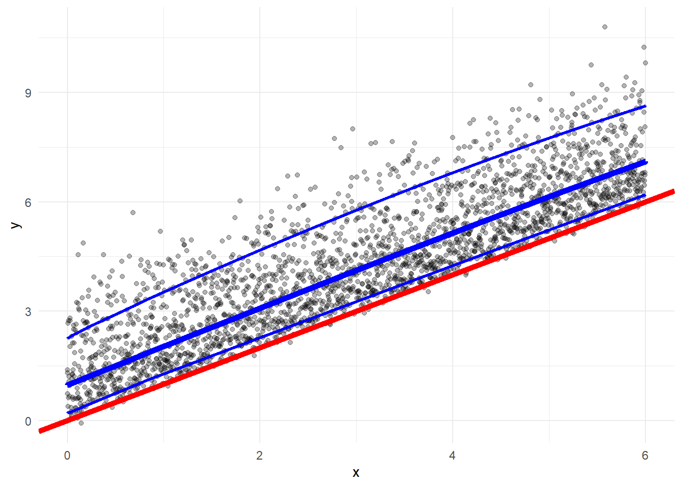
This looks about right, now let’s double check the quantile numbers.
mean(pred_df$y<pred_df$qtle_10)## [1] 0.114mean(pred_df$y<pred_df$qtle_50)## [1] 0.5088mean(pred_df$y>pred_df$qtle_90)## [1] 0.1156And this confirms it, 11.4% below the 10th quantile, 50.9% below the 50th quantile, and 11.6% above the 90th quantile.
While the loc and skewness number are borrowing from one another, we’re still getting a good (if not overfit) representation of the distribution. This is definitely something to monitor when building the network. With more parameters, there’s more of a balancing act.
Football Data
As I discussed above, the Big Data Bowl was a competition where we were asked to predict the yards of a given rush using Next Gen Stats (spatial representations of the field). Participants were NOT asked to make a single prediction about how many yards a run would go, but rather the distribution of possible yards a run would go. A perfect problem for Tensorflow probability!
One interesting component of this problem is truncation. Based on the starting yard line, there is only so many possible yards the rusher can end. For example, a play starting on the opponent’s one yard line can only go 1 yard forward, and 99 yards backward. Conversely, a play starting on an offense’s one yard line can only go one yard backward, and 99 yards forward.
What I want to see with Tensorflow probability is if the model can pick up something approximating this truncation (it certainly won’t be perfect without explicitly accounting for it.)
To do this, I’ll try to predict the distribution of yards using only starting yard line, and using gganimate we can visualize how the probability distribution changes as starting yard line changes.
First I’ll read in the data, engineer the starting yard line features. limit it to just the rusher, and create a train/test split.
df <- read_csv('~/Analyses/fantasy_football/Big_Data_Bowl_19/data/train.csv', guess_max = 10000)

train_prop <- round(length(unique(df$PlayId))*.8)

train_ids <- sample(df$PlayId, train_prop)

df <- df %>%
  mutate(ToLeft = PlayDirection == "left",
         IsBallCarrier = NflId == NflIdRusher,
         TeamOnOffense = ifelse(PossessionTeam == HomeTeamAbbr, "home", "away"),
         IsOnOffense = Team == TeamOnOffense,  ## Is player on offense?
         YardsFromOwnGoal = ifelse(as.character(FieldPosition) == PossessionTeam,
                                   YardLine, 50 + (50-YardLine)),
         YardsFromOwnGoal = ifelse(YardLine == 50, 50, YardsFromOwnGoal)) %>%
  dplyr::filter(IsBallCarrier)


test <- df %>%
  dplyr::filter(!PlayId %in% train_ids)


train <- df%>%
  dplyr::filter(PlayId %in% train_ids)


x <- train$YardsFromOwnGoal %>% as.matrix()
y <- train$Yards


x_val <- test$YardsFromOwnGoal %>% as.matrix()
y_val <- test$Yards
Now, similar to the run with the simulated data, I’ll define and run the model. This one required an extra layer to fit properly, but it’s still fairly simple.
model <- keras_model_sequential() %>%
  layer_dense(units = 16, activation = 'relu') %>%
  layer_dense(units = 16, activation = "relu") %>%
  layer_dense(units = 4, activation = "linear") %>%
  layer_distribution_lambda(function(x) {
    tfd_sinh_arcsinh(loc = x[, 1, drop = FALSE],
                     scale = 1e-3 + tf$math$softplus(x[, 2, drop = FALSE]),
                     skewness=x[, 3, drop=FALSE],
                     tailweight= 1e-3 + tf$math$softplus(x[, 4, drop = FALSE]),
                     allow_nan_stats=FALSE)
  }
  )

negloglik <- function(y, model) - (model %>% tfd_log_prob(y))


learning_rate <- 0.01
model %>% compile(optimizer = optimizer_adam(lr = learning_rate), loss = negloglik)


history <- model %>% fit(x, y,
                         validation_data = list(x_val, y_val),
                         epochs = 1000,
                         batch_size=500,
                         callbacks=list(callback_early_stopping(monitor='val_loss', patience = 20))
)
Since there we only have 1 predictor with 99 inputs, I’ll just create a single vector to represent all possible outputs, and apply the model to that.
pred_dist <- model(tf$constant(as.matrix(1:99)))

loc <- pred_dist$loc %>% as.numeric()
scale <- pred_dist$scale %>% as.numeric()
skewness <- pred_dist$skewness %>% as.numeric()
tailweight <- pred_dist$tailweight %>% as.numeric()

yd_pred <- data.frame(YardsFromOwnGoal=1:99, loc, scale, skewness, tailweight)
Next I’ll look at how the distribution parameters change by starting yard line
p1 <- ggplot(yd_pred, aes(x=YardsFromOwnGoal, y=loc)) +
  geom_point() +
  geom_line() +
  ggtitle('Location by Starting Yard Line')


p2 <- ggplot(yd_pred, aes(x=YardsFromOwnGoal, y=scale)) +
  geom_point() +
  geom_line()  +
  ggtitle('Scale by Starting Yard Line')


p3 <- ggplot(yd_pred, aes(x=YardsFromOwnGoal, y=skewness)) +
  geom_point() +
  geom_line()  +
  ggtitle('Skewness by Starting Yard Line')


p4 <- ggplot(yd_pred, aes(x=YardsFromOwnGoal, y=tailweight)) +
  geom_point() +
  geom_line() +
  ggtitle('Tailweight by Starting Yard Line')


(p1 + p2)/(p3 + p4)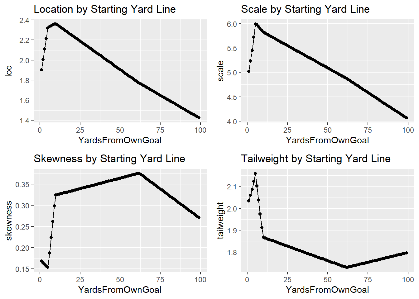
We can see that each parameter changes by starting yard line, which means that the distribution will change as we move down the field.
To illustrate this, I’ve created a gif in gganimate that shows how the predicted distribution changes as a team moves down the field.
get_distr_function <- function(loc, scale, skewness, tailweight){
  yds <- dSHASH(c(-10:10),
                mu=loc,
                sigma = scale,
                nu = skewness,
                tau = tailweight)

  return(yds)
}


inp_list <- list(loc = yd_pred$loc,
                 scale = yd_pred$scale,
                 skewness = yd_pred$skewness,
                 tailweight = yd_pred$tailweight)

out_list <- pmap(inp_list, get_distr_function)

yd_pred$out_list <- out_list


yd_pred_long <- yd_pred %>% unnest(out_list) %>% mutate(yds=rep(-10:10, 99))


anim <- yd_pred_long %>%
  ggplot(aes(x=yds, y=out_list)) +
  geom_point() +
  geom_line() +
  transition_time(YardsFromOwnGoal) +
  theme_minimal() +
  labs(title = 'Estimated Distribution of Yards Gained by Starting Yard Line',
       subtitle = 'Starting Yard Line: {frame_time}',
       x='Yards Gained',
       y='Probability')
anim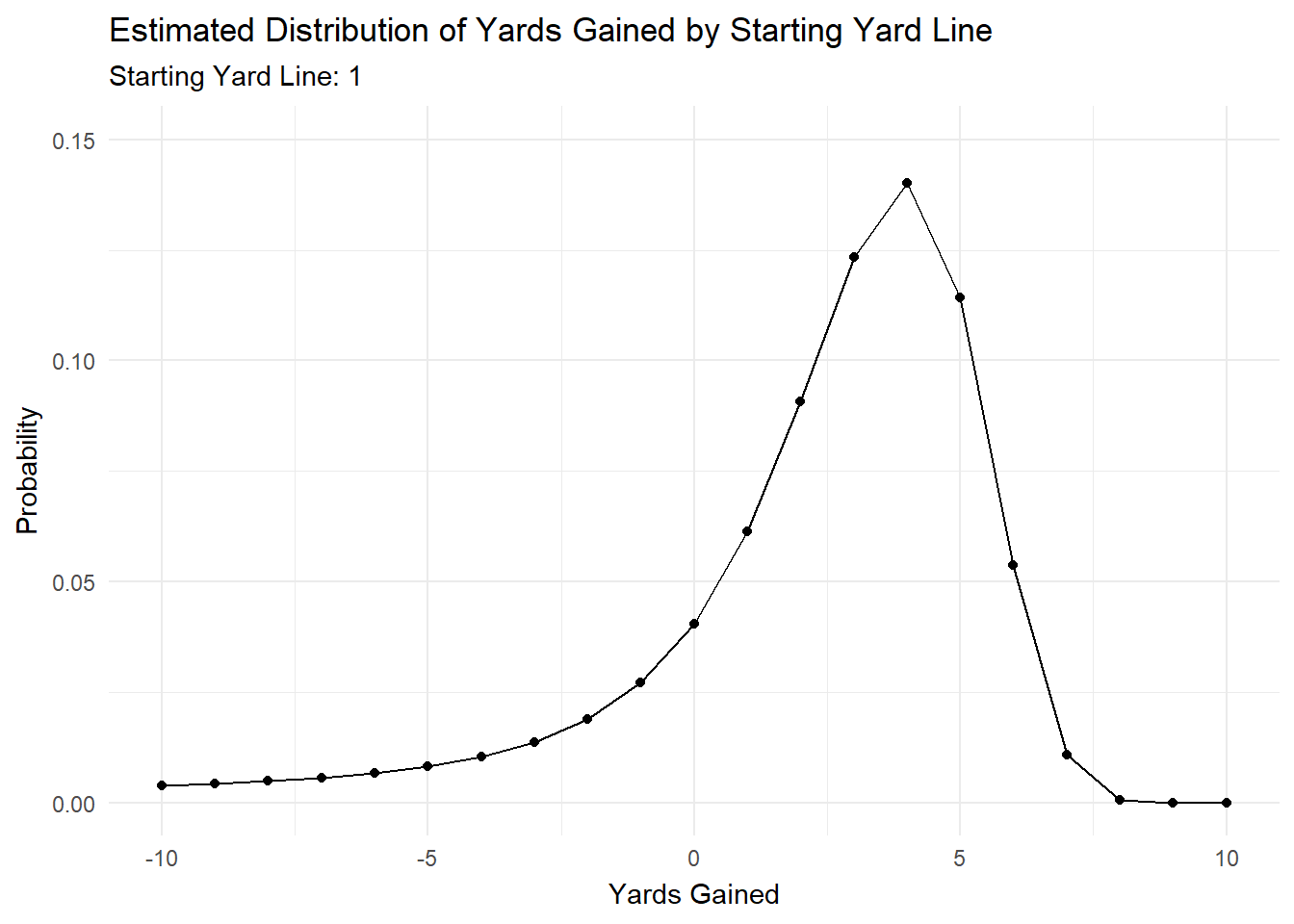
Most of the action is at the beginning and end, but it’s cool to see how the distributions changes as starting yard line changes.
Financial Data
One of the common phrases I’ve heard as I’ve learned more about the stock market is to ‘Think Probabalistically.’ In other words, don’t just evaluate a decision based on what happened, evaluate on what was likely to happen, or what would be highly profitable if it had happened. But most of the time, there aren’t the tools available to examine the empirical distribution, so you’re mostly guessing when you’re trying to evaluate decisions in this way.
Even within machine learning and statistical modeling, you mostly chose between regression (for continuous outcomes) and classification (for categorical outcomes). With stocks, you can set up the problem as predicting the price the next trading period, or whether the stock is going to go up or down (raw or above a certrain threshold). The limitations with regression problems is that you only get a single point that there’s inevitability going to be error around, and while we minimize that error, we don’t know how much there’ll be with a given point. With classification, we don’t get an estimate of magnitude, a stock that goes up .01% and one that goes up 35% in a single period will be classified the same.
Modeling with distributions allows us to split this difference. With the ability to look at CDFs as well as quantiles, you can ascertain the probabilty of of a stock going over or under a certain threshold (like you would with a classification problem) while also examining potential upside or downside (CDFs at very high or low tresholds, or quantiles at the ends of the distribution). You can also take skewness into account to see if the distribution is biased a certain way.
From what I’ve seen in finance so far, being able to estimate the range of possible outcomes with probability estimates would seem to provide more of an edge than just a single point prediction with uncertainty inferred (likely assuming a normal distribution). Perhaps it’s naive, but I think this is a promising approach.
To do a basic test of this, I’ve pulled daily close prices from Nasdaq and NYSE stocks from 2016 to present. I’m going to feed those through a model with a sequential layer, theoretically picking up info on how previous price movements affect same day price. To standardize, I’ve transformed all prices into ratios of the price the day before we make the prediction. For example a stock with price 2.5 the day before prediction, a price of 2.9 the day of prediction and 2.3 the day before prediction will be represented as 1, 1.16, and 0.92, respectively.
Now for the fun caveats associated with financial posts. None of this is intended as investment advice, or anything like that. I also know that this model comes nowhere near what would be necessary to actually have a profitable algo to trade. The main reasons, among many others, are that I’m using a convenience sample of dates, I don’t tune the model very much, I don’t look into any alternative data to use, there are problems with representing prices as ratios, not account for volume, market conditions, not having a careful temporal sampling strategy, and a lot more that I’m forgetting right now.
The main point of this post isn’t accurate prediction, but rather as a POC to see if we can fit a distribution that somewhat represents the spread of price movement.
First, prep the data
nasdaq <- readRDS('nasdaq_wide.RDS')

nyse <- readRDS('nyse_wide.RDS')

multi <- nasdaq %>%
  bind_rows(nyse)


rm(nasdaq)
rm(nyse)


train_ticker <- sample(multi$ticker, 1300)

x_train <- multi %>%
  filter(ticker %in% train_ticker) %>%
  select(price31:price2) %>%
  as.matrix()

y_train <- multi %>%
  filter(ticker %in% train_ticker) %>%
  .$out1


x_test <- multi %>%
  filter(!ticker %in% train_ticker) %>%
  select(price31:price2) %>%
  as.matrix()

y_test <- multi %>%
  filter(!ticker %in% train_ticker) %>%
  .$out1

reshape_X_3d <- function(X) {
  dim(X) <- c(dim(X)[1], dim(X)[2], 1)
  X
}

x_train <- reshape_X_3d(x_train)

x_test <- reshape_X_3d(x_test)
Next, define and fit the model
model <- keras_model_sequential() %>%
  layer_lstm(units=64, input_shape = c(NULL, dim(x_train)[2], 1)) %>%
  layer_dense(units=16, activation = 'relu') %>%
  layer_dense(units = 32, activation = 'relu') %>%
  layer_dense(units=16, activation = 'relu') %>%
  layer_dense(units = 4, activation = "linear") %>%
  layer_distribution_lambda(function(x) {
    tfd_sinh_arcsinh(loc = x[, 1, drop = FALSE],
                     scale = 1e-3 + tf$math$softplus(x[, 2, drop = FALSE]),
                     skewness=x[, 3, drop=FALSE],
                     tailweight= 1e-3 + tf$math$softplus(x[, 4, drop = FALSE]),
                     allow_nan_stats=FALSE)
  }
  )

negloglik <- function(y, model) - (model %>% tfd_log_prob(y))

learning_rate <- 0.001
model %>% compile(optimizer = optimizer_adam(lr = learning_rate), loss = negloglik)

history <- model %>% fit(x_train, y_train,
              validation_data = list(x_test, y_test),
              epochs = 500,
              batch_size=1000,
              callbacks=list(callback_early_stopping(monitor='val_loss', patience = 20)),
)
Now that the model is trained, I’ll extract the parameters, some quantiles, and throw them into a data frame.
pred_dist <- model(tf$constant(x_test))

loc <- pred_dist$loc %>% as.numeric()
quantile(loc, probs = seq(0, 1, .1))
sd <- pred_dist$scale %>% as.numeric()
quantile(sd, probs = seq(0, 1, .1))
skewness <- pred_dist$skewness %>% as.numeric()
quantile(skewness, probs = seq(0, 1, .1))
tailweight <- pred_dist$tailweight %>% as.numeric()
quantile(tailweight, probs = seq(0, 1, .1))

pred1 <- pred_dist$cdf(1) %>% as.numeric()
quant10 <- pred_dist$quantile(.1) %>% as.numeric()
quant25 <- pred_dist$quantile(.25) %>% as.numeric()
quant50 <- pred_dist$quantile(.5) %>% as.numeric()
quant75 <- pred_dist$quantile(.75) %>% as.numeric()
quant90 <- pred_dist$quantile(.9) %>% as.numeric()

pred_df <- data.frame(loc, sd, skewness, tailweight, pred1, quant10, quant25, quant50, quant75, quant90, actual=y_test)
There are many ways to evaluate the performance of distributional models, for the purposes of this post, I’ll look at various quantiles, and whether the underlying data crossed those quantiles at the expected rate.
First, I’ll create variables to specify how often stocks go over expected quantiles, and plot the results
pred_df$up_10 <- as.numeric(pred_df$actual>pred_df$quant10)
pred_df$up_25 <- as.numeric(pred_df$actual>pred_df$quant25)
pred_df$up_50 <- as.numeric(pred_df$actual>pred_df$quant50)
pred_df$up_75 <- as.numeric(pred_df$actual>pred_df$quant75)
pred_df$up_90 <- as.numeric(pred_df$actual>pred_df$quant90)


pred_df %>%
  select(up_10:up_90) %>%
  summarize_each(funs = mean) %>%
  pivot_longer(up_10:up_90, names_to = 'over_quantile', values_to = 'pct') %>%
  ggplot(aes(x=over_quantile, y=pct, label=scales::percent(pct, accuracy = .01))) +
  geom_col() +
  geom_text(vjust=1, color='white') +
  theme_minimal() +
  scale_y_continuous(labels=scales::percent) +
  ggtitle('% Stocks Going Over Specified Quantile')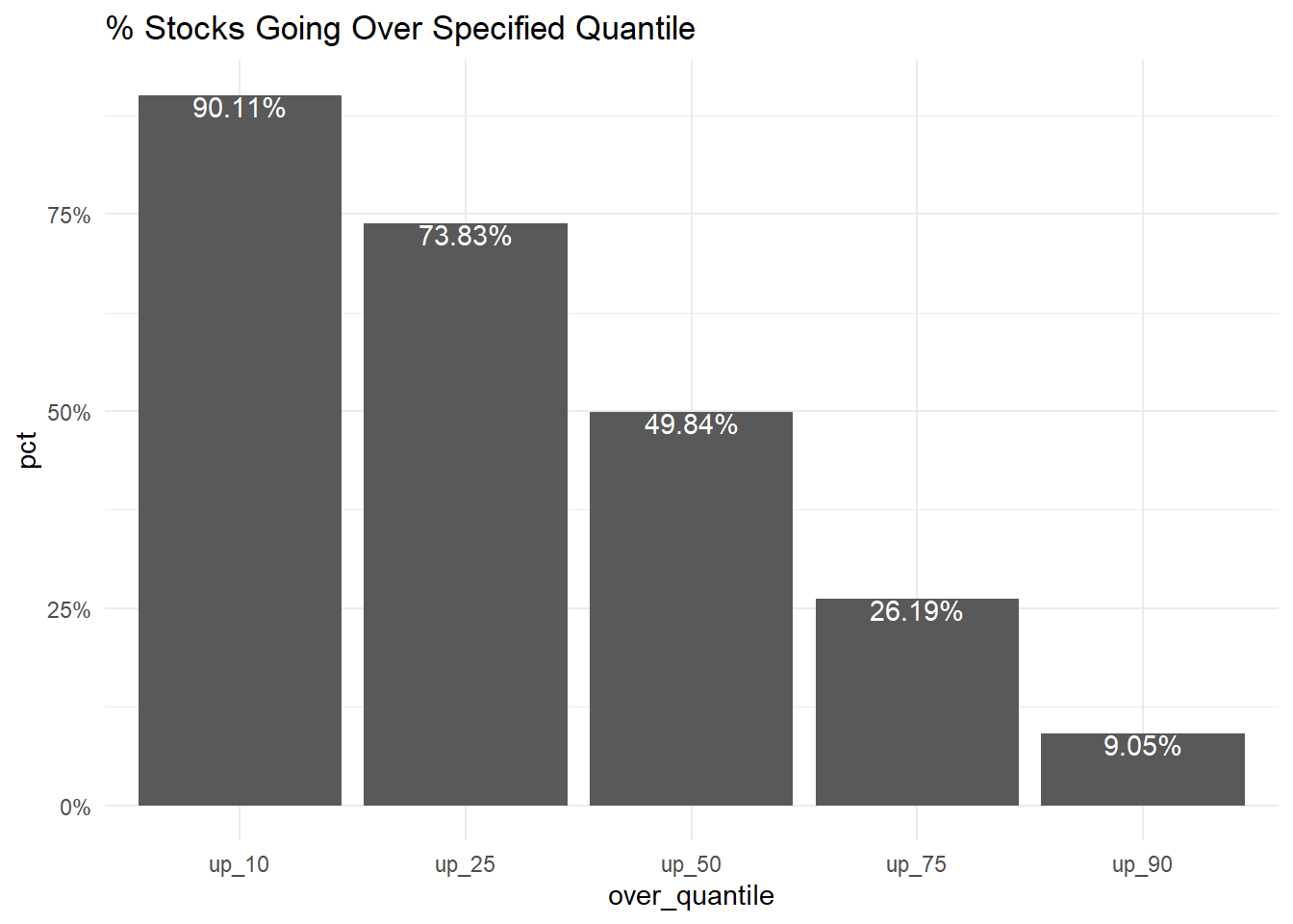
This all shows up as expected, with 90.11% of prices going over the 10th quantile, 73.83% of prices going over the 25th quantile, 49.84% of prices going over the 50th quantile, 26.19% of prices going over the 75th quantile, 9.05% of prices going over the 90th quantile.
Obviously with all the caveats of the model, that’s a pretty good results! If nothing else, this serves as a proof of concept that this type of model can fit the distribution.
Takeaways
Applications for these distributional models are pretty exciting! It’s exciting to be able to explicitly model probability distributions. Specifically, I think, if used carefully, it can be better used to communicate better with business users. I’ve seen non-technical folks dismiss 95% prediction intervals as being just too wide, because often how these are visualized, it looks like an outcome is equally as likely to be anywhere within the shaded area. This allows us to narrow down a bit more.
You can also assess probabilitys at any given point on the distribution. If a business user wants to know the probability the a customer spends over a certain threshold, or a security going over a certain threshold, and that threshold changes fairly often, you can rely on the same model rather than having to fit multiple quantile regression models, or manually calculating CDFs.
You also get to merge the works of statistical modeling and distributions, with the firepower of Tensorflow. You can estimate distributions using computer vision, NLP, and whatever else you can imagine.
Granted, I’m fairly new to this type of modeling, but it looks you can kind of have to cake and eat it too.
I’ve just discovered a hammer, and everything looks like a nail right now, so I’m pretty pumped about the possibilities of this type of modeling, and I’ll be exploring other applications, and drawbacks in future posts.
